based on IEA (2023), “Greenhouse gas emissions from energy”;
click image to enlarge; click here to download a PDF
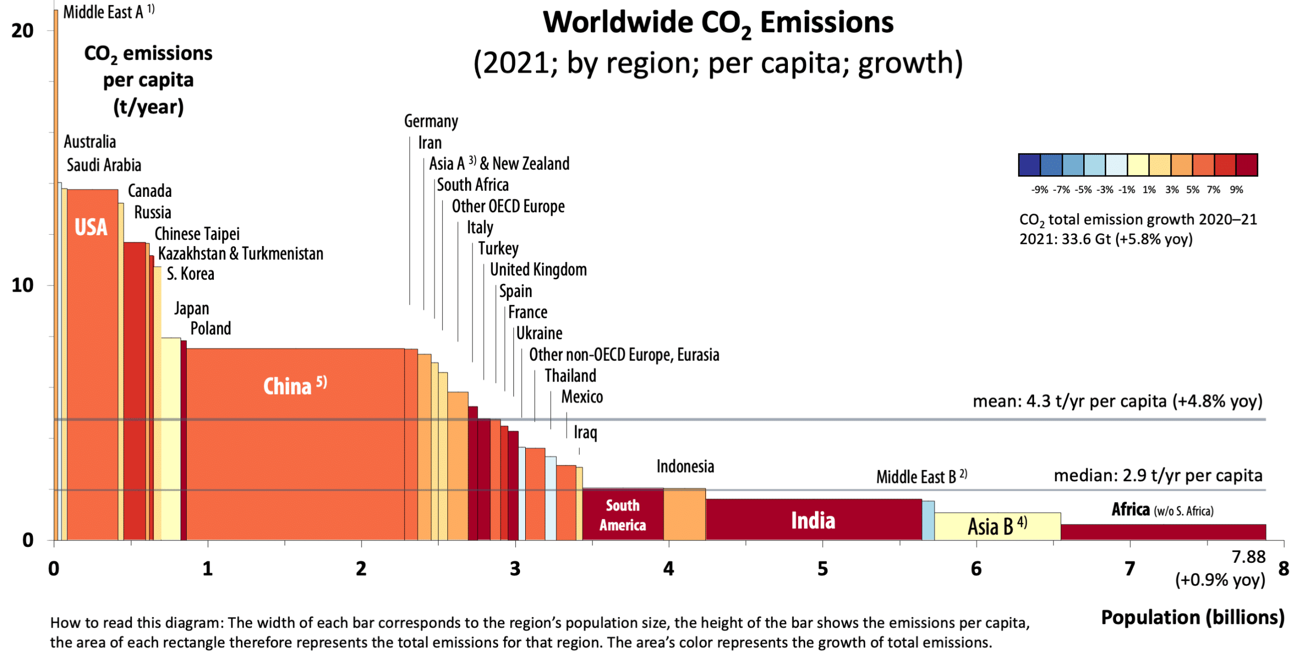
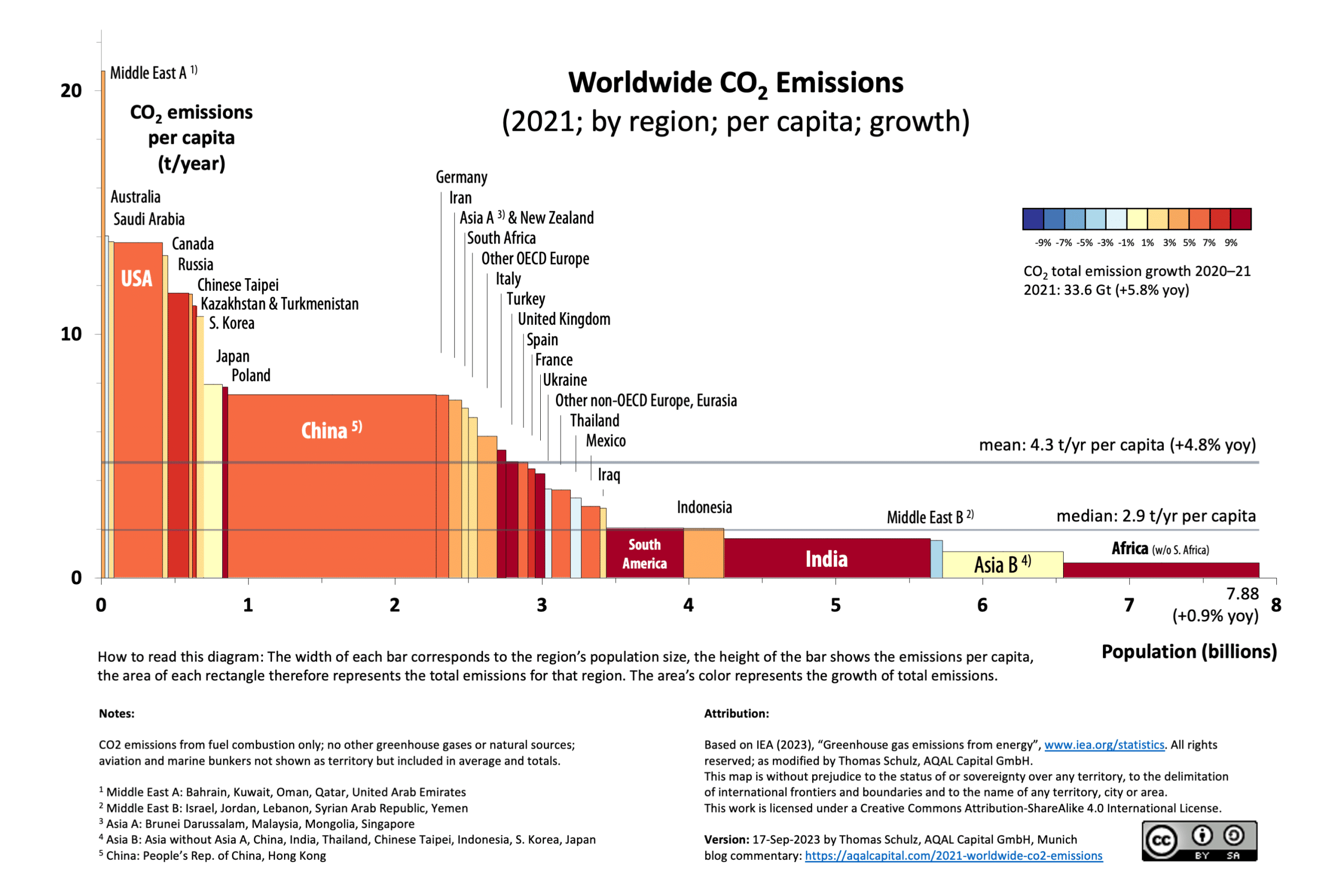
Global anthropogenic emissions picked up growth again in 2021 over 2020
In 2021, global emissions reached 33.6 Gt CO2, a 5.8% increase from 2020, likely due to the post-pandemic economic rebound. Nearly all countries contributed to this rise. Compare our 2020 variwide chart here.
Around 0.9% of the increase was due to population growth, while a significant 4.8% stemmed from rising per capita emissions.
Notably, China’s emissions grew by 595 Mt (5.9%), equivalent to Germany’s total emissions in 2020.
Wide spectrum in per capita emissions
In 2021, the global average per capita CO2 emissions stood at 4.3 t/yr, reflecting a 4.8% increase from the preceding year.
This year, we introduced a median per capita emission calculation, revealing a stark dichotomy: half of the world’s population emits less than 2.9 t/yr per capita, a figure notably lower than the mean (4.3 t/yr). This disparity underscores the substantial variation in emissions, exemplified by Germany’s 7.5 t/yr per capita emissions, which not only surpasses the “average” (arithmetic mean) by 76% but also exceeds the value for half of the global population (median) by a staggering 161%.
Per capita emissions exhibit wide disparities across different regions, with developed countries like Qatar boasting figures as high as 32 t/yr, while developing nations like Yemen register levels as low as 0.25 t/yr.
Remarkably, the gap between Qatar and the region of Africa (excluding South Africa) in terms of per capita emissions has widened to 50 times, up from 40 times in 2019.
Within the OECD, a notable disparity exists in per capita CO2 emissions, with the average American or Canadian emitting approximately 2.5 times more than their OECD European counterpart, totaling around 14 t/yr versus 5.6 t/yr, respectively. Meanwhile, China, with its per capita emissions at 7.5 t/yr, notably exceeds the global average of 4.3 t/yr, affirming its developed status in the realm of CO2 emissions. Strikingly, the average German’s per capita emissions align closely with those of the average Chinese.
Adjacent Nations, Disparate Emissions
Another striking example of how disparate per capita emissions can be, even between similar neighboring countries: Germany at 7.5 t/yr contrasts with France’s 4.3 t/yr, reflecting contrasting energy strategies. France relies on nuclear power while Germany still depends on coal and gas.
Economic Development within the net-zero framework and respecting Planetary Boundaries
In contrast, regions such as the remainder of Asia, India, South America, and Africa register per capita emissions considerably below the global average. Nevertheless, these regions are undergoing significant economic and demographic transitions, contributing to an upward trajectory in their CO2 emissions. It’s worth noting that if all countries were to raise their per capita emissions to the world average, this would result in a 40% surge in global emissions. However, this development must occur within the strict confines of achieving net-zero CO2 emissions and respecting Planetary Boundaries to ensure a sustainable future.
by Thomas Schulz and Mariana Bozesan, AQAL Capital GmbH, Munich
How to understand the variwide chart
This type of visualization answers immediately questions like
- “Which countries are the largest CO2 emitters?”
- “How significant is the spread between per capita emissions in different countries?”
- “Which countries are reducing their CO2 emissions?”
- “Which countries are still increasing their CO2 emissions?”
- What are the world’s average per capita CO2 emissions (arithmetic mean)?
- What are the CO2 emissions of the average human (arithmetic median)?
The variwide chart allows the visualization of a multitude of data dimensions in one easy-to-read diagram. These data dimensions are:
- Individual country data, such as China, South Africa, or the USA, or a group of countries such as the Middle East or Africa,
- Population by country or group of countries,
- Per capita CO2 emissions, and
- CO2 emissions growth year-over-year
The total CO2 emissions of a region are represented as a rectangular area. The height of each rectangle is proportional to the CO2 emissions per capita and the width is proportional to the population of the represented region. The regions are sorted by CO2 emissions per capita, from the highest to the lowest.
The per capita emission average is indicated by the horizontal red line.
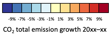
The colors of the rectangles indicate their growth rate: “heating up” is represented from light red to dark red, and “cooling down” goes from light blue to dark blue.
Note: We are using the latest IEA data set “CO2 Emissions from Fuel Combustion”. These numbers do not include other greenhouse gases, or other CO2 emissions, such as from volcanic activity or agriculture. However, they are a good proxy for human-made (=anthropogenic) emissions.
Reference: International Energy Agency (2023). Greenhouse gas emissions from energy (retrieved on Sep 14, 2023, at https://www.iea.org/statistics)
2021 Worldwide CO2 Emissions (by region; per capita; growth), variwide chart by Thomas Schulz is licensed under CC BY-SA 4.0![]()
![]()
![]()