by Thomas Schulz, AQAL Capital GmbH, Munich
AQAL Capital releases annual update to “Worldwide CO2 Emissions” variwide chart.
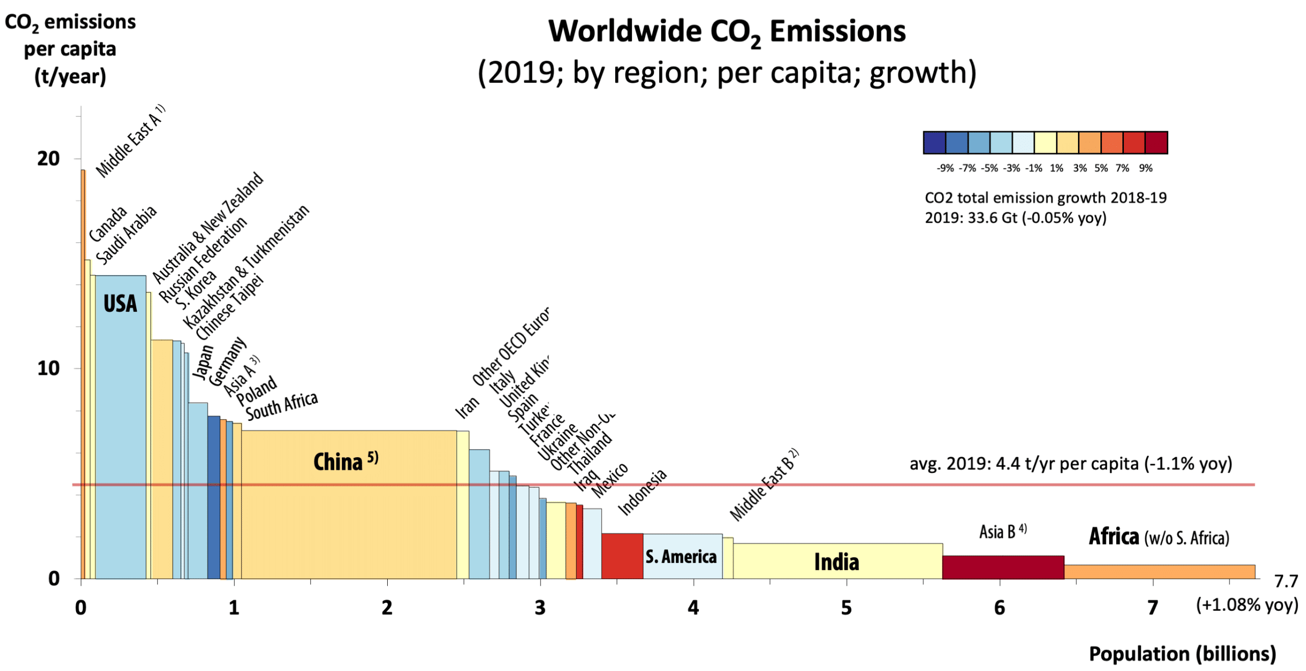
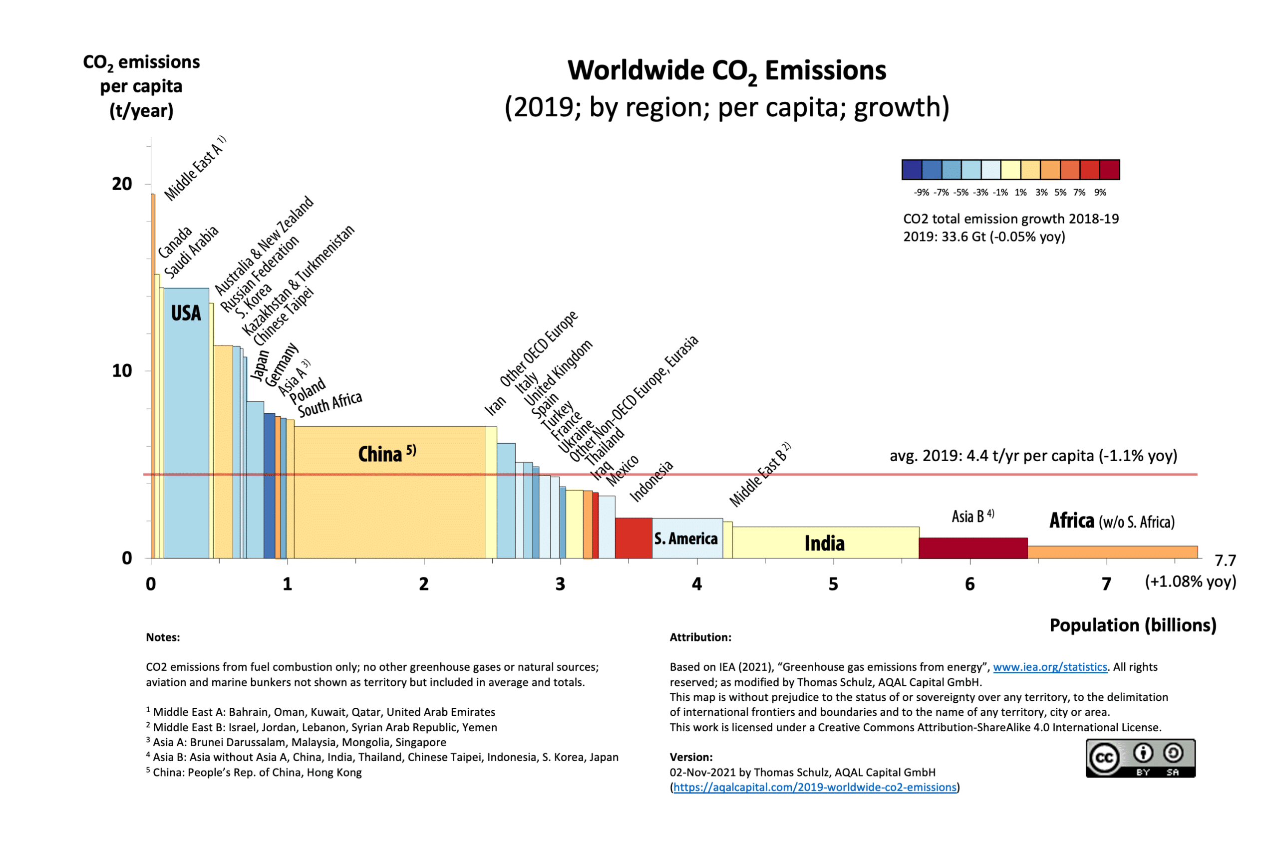
Based on the October 2021 CO2 emissions report of the International Energy Agency (IEA 2021) (representing the 2019 data set), please find our updated variwide chart of anthropogenic CO2 emissions. The findings are mindboggling, visually striking, and sobering!
based on IEA (2021), “Greenhouse gas emissions from energy”;
click image to enlarge; click here to download a PDF
Anthropogenic emissions: No change from 2018
The aggregate worldwide emissions were 33.6 Gt CO2 in 2019. Note: We are using the latest IEA data set “CO2 Emissions from Fuel Combustion”. These numbers do not include other green house gases, or other CO2 emissions, e.g. from volcanic activity or agriculture. However, they are a very good proxy for human-made (anthropogenic) emissions.
The goal of COP26 (the UN Climate Change Conference UK 2021 in Glasgow) is to achieve net zero emissions by 2050. Obviously this is a very difficult objective as the total emissions have virtually not changed from the year before (-0.05% from 2018).
Average per capita emissions remain unchanged
The average emissions per capita in 2019 were 4.4 t/yr, and have slightly decreased by 1% from 2018. However, since the world population grew by 1% to 7.7 billion, the effect was neutralized — keeping the total emissions unchanged. This means, without taking the population growth into account and counteracting it, we won’t achieve the net zero goal by 2050.
Significant inequality
There is a very wide spread in per capita emissions between different regions of the world. We see that the per capita emissions of developed countries can be as high as 31 t/yr (Qatar), while that of developing countries can be as low as 0.7 t/yr (Africa w/o S. Africa). This spread is greater than 40x. This correlates with the inequal global distribution of wealth.
The heavily skewed picture also suggests that we can expect a capital transfer from the left (high-emitters/developed countries) to the right (low-emitters/developing countries). Someone has to pay for the renewable energy infrastructure in India, South America, Asia, and Africa… and fact is, the money is in North America, Australia, Europe, and the OPEC countries.
The largest blocks in the chart determine the future
The U.S. and Canada are emitting 2-3 times (~14-15 t/yr) more per capita than Europe (~4.4-7.8 t/yr). China with 7.1 t/yr is well above the world average of 4.4 t/yr and has reached the status of a developed country in terms of CO2 emissions. Due to its large population (1.4 billion) and ongoing industrialization, China has become a significant emitter of CO2 emissions. This is due in part to the fact that several other countries have often “exported their CO2 emissions” to China by importing Chinese goods.
The rest of Asia, especially India, and Africa are well below the world average, but they are catching up economically and therefore in CO2 emissions. Many of these countries have increased both their population and per capita emissions.
Summary: Transformation is Feasible
We clearly see very different positions of the world’s countries. The “high emitters” face a complex challenge: 1) accelerate their switching to an economy based on renewable energy, 2) accept the losses from stranded assets (switching off fossil-fuel based infrastructure before their end of life), and 3) finance renewable energy infrastructure in the low-emitter regions.
On the other side, “low emitters” are currently in a catch-up phase. Their priority is economic development that is linked to higher energy usage. They are called upon to give up any plans based on fossil fuels, and instead invest in renewable energies.
How can these two sides work together?
Again, let’s remind ourselves, that the 4.4 t/yr/capita CO2 emissions must go to ZERO by 2050 (the red line must go down to zero). Beyond 2050, we even will have to remove CO2 from the atmosphere to limit the global average temperature rise to 1.5 degrees Celsius.
The CO2 reduction efforts currently taking place in some industrial countries such as Germany, France, Italy, and other European countries, contribute a relatively small portion to the net zero goal. However, the leadership role these countries can play should not be underestimated because they pave the way toward a low-carbon economy for bigger polluters to follow. However, the newly revived investments into nuclear power are not sustainable, for they shift the responsibility and risks due to nuclear waste to future generations. Replacing the dangers of climate change with the risks associated with nuclear waste would be counteractive and defeats the purpose of COP26.
In summary, it becomes obvious that without significant decrease in CO2 emissions by the world’s largest polluters such as the United States and China, the Earth will not be able to absorb additional CO2 emissions to make room for developing nations such as India and African nations to develop. Because of the existing imbalance, developing countries will not have the room to increase their own per capita emissions without endangering the safe operating system of our planet. It goes without question that developed countries are to be made responsible for the current misery. But to what use? Moving forward, the fate of the Earth is being determined by the course of action taken by both developed and developing countries.
Although the overall picture remains sobering, it also provides a clear focus on the urgency of addressing the problem: anthropogenic climate change and on the actions to be taken. Humanity needs significant and collective action on many fronts. As far as we are concerned, the best proposal thus far has been made by the Stockholm Resilience Centre through their 2018 report to the Club of Rome “Transformation is Feasible”. This report has significantly informed and influenced the investment strategy and tactics of our family office, which we summarized in our recently published book and report to the Club of Rome Integral Investing: From Profit to Prosperity.
How to understand the variwide chart
This type of visualization answers immediately questions like
- “Which countries are the largest CO2 emitters?”
- “How significant is the spread between per capita emissions in different countries?”
- “Which countries are reducing their CO2 emissions?”
- “Which countries are still increasing their CO2 emissions?”
The variwide chart allows the visualization of a multitude of data dimensions in one easy-to-read diagram. These data dimensions are:
- Individual country data, such as China, South Africa, or the USA or a group of countries such as Middle East, Africa, or Australia/New Zealand,
- Population by country or group of countries,
- Per capita CO2 emissions, and
- CO2 emissions growth year-over-year
The total CO2 emissions of a region are represented as a rectangular area. The height of each rectangle is proportional to the CO2 emissions per capita and the width is proportional to the population of the represented region. The regions are sorted by CO2 emissions per capita, from the highest to the lowest.
The emission average per capita is indicated by the horizontal red line.
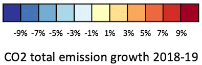
The color of the rectangles indicate their growth rate: “heating up” is represented from light red to dark red, and “cooling down” goes from light blue to dark blue.
Reference: International Energy Agency (2021). Greenhouse gas emissions from energy (retrieved on Oct 30, 2021 at https://www.iea.org/statistics)
2019 Worldwide CO2 Emissions (by region; per capita), variwide chart by Thomas Schulz is licensed under CC BY-SA 4.0![]()
![]()
![]()